5.9.2019 - Jussi Kemppainen
Using After Effects for UI artwork
For the longest time I tried to fight back the tropes of fantasy game UIs, but now after a lot of push-back from the team I have succumbed under the pressure and am now redoing the UI artwork.
I wanted to go all in crazy detailed and polished lookm but without resorting to boring old Photoshop layer styles. I wanted to go more detailed. So, I fired up the old and trustworthy video effects software After Effects to achieve just that!
After Effect VS Photoshop
Photoshop is great! All of the nice details and things I wanted to do for the UI would have been perfectly possible in Photoshop. But with one caveat: it is destructive. Once I applyu a filter, it is baked into the pixels. For example, there is no way for me to create a nice beveled effect where the nooks and crannies of the uneven surfaces affect the lighting effect and the nchange the shape of the UI element silhouette afterwards. Photoshop bakes all that stuff in and locks me into decisions I am not sure of.
After effects does not do that! I can have the whole UI editable at all times from every aspect. The drawback is that I can not edit it like it was pixels. No lasso tool selecting for quickly copy pasting elements or using brushes to touch up on areas that do not quite look how I would want them to. As long as you accept the limitations of non-destructive workflow. it is aeons better than the old way.
Non-destructive maximum polish UI
Here is the final look we are going to go for (or parts of it, some of it is still under construction):
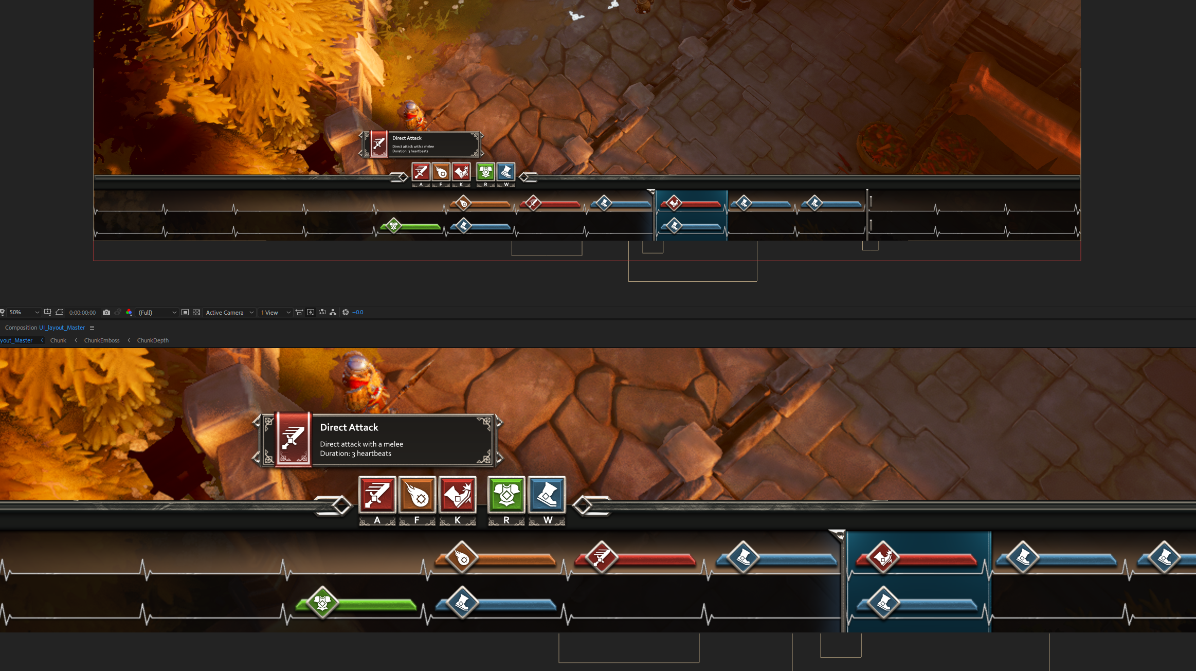
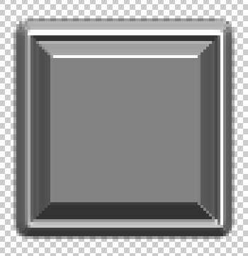
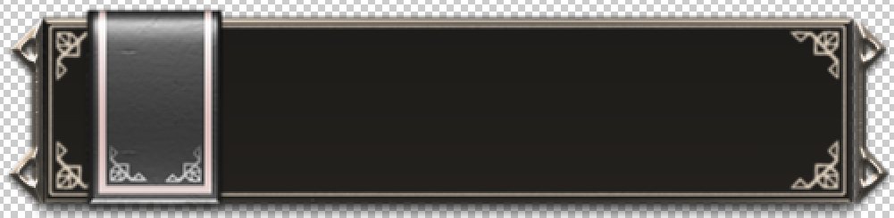
Pretty classic fantasy UI that has some nice depth and details and lighting and a feeling of substance.
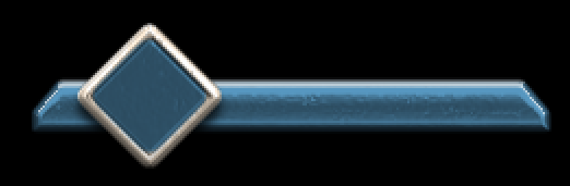
Each UI element consists of at least 3 levels of elements. First, we have the actual element itself, a button for example.
This is the button element currently used in the new UI in the game. (The blue coloring is just for example, we color the element in Unity based on the action it represents)
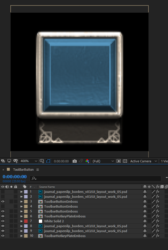
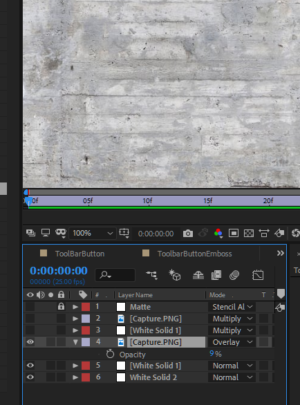
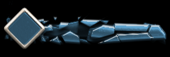
I combine the different layers at this stage. The little flap for the hotkey, it’s ornament details, the button enement and drop shadows.
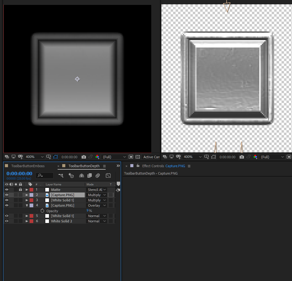
Let’s take a look at the ToolBarButtonEmboss element.
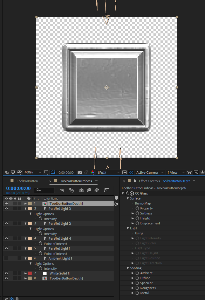
This layer has bit of a 3D in it. namely the lights. I am using 3D lights to define the shape of the button. The shape is created with a depth map based effect called “CC Glass”.
I am not actually using it to mimic glass, but metal instead. It can be achieved by turning off the distortion properties of the effect completely. This effect allows us to achieve this embossed look with surface detail that we can precisely control by feeding it any gray-scale depth map. This allows us to use the same look for any shape imaginable with any bevel shape we want.
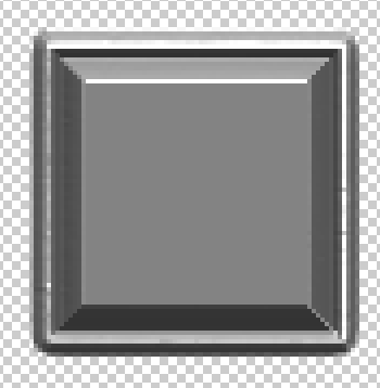
Here are all the different elements that create the depth map for the button:
The basic shape

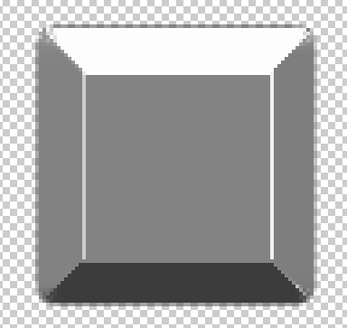
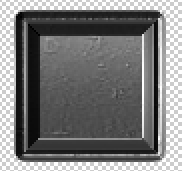
For this simple button. I simply have a rectangular mask on a while solid. For the base of the depth map, an Inner glow layer style has been added. (It is exactly the same as it is in photoshop. Just the controls look a bit different.). The image on the right is how the CC Glass effect looks like with this layer only.
I added a choke effect there to clean up the edge of the shape as well (it makes the shape shrink by a pixel). The glass effect had some artifacts on the button edge, so that was fixed by the choke.

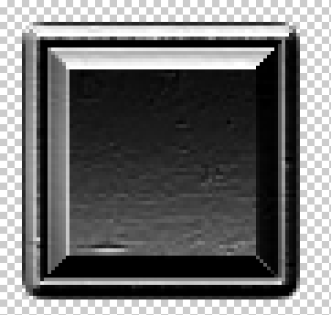
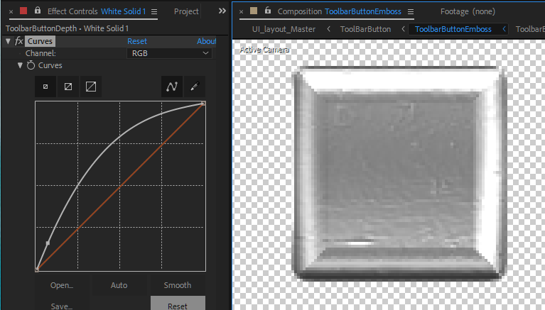
This inner glow effect is then modified with a curves adjustment layer. Now, if we think of this as a 3D object instead of a 2D gradient. that curve actually shows the cross section of the button bevel. This is the shape that will be affected by all those 3D lights one element upstream (ToolbarButtonEmboss).
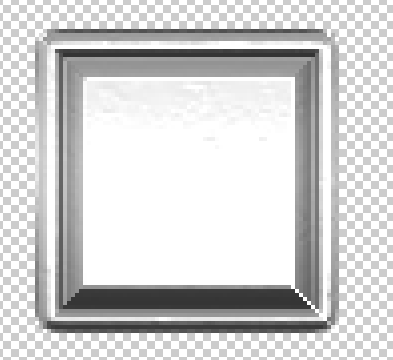
Next layer is bit of a photo texture. With a black and white concrete image I can introduce some details in the bevel. I am actually using 2 copies of the same photo, with this layer on overlay mode so it only affects the beveled edge, not the button inside shape.
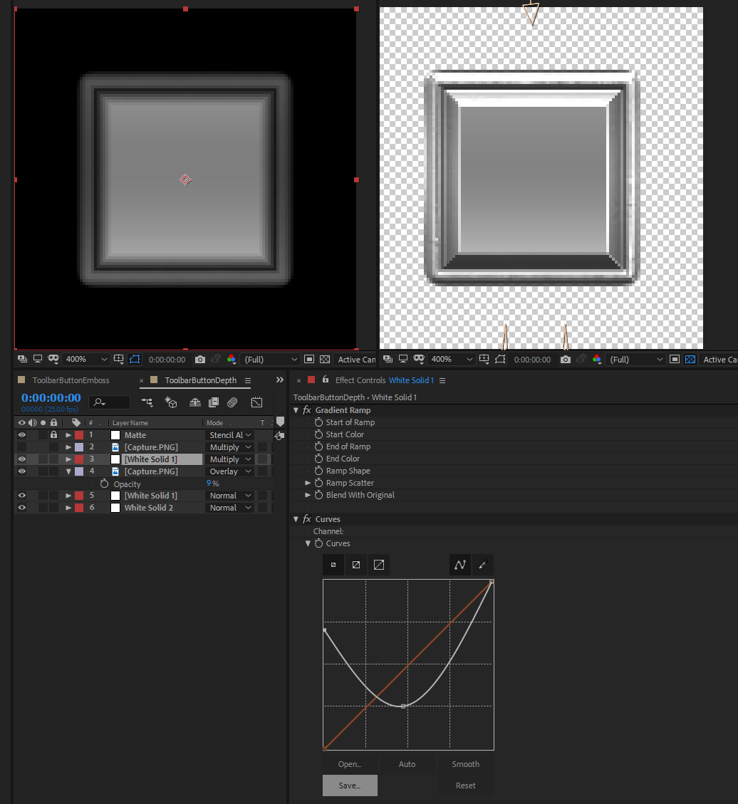
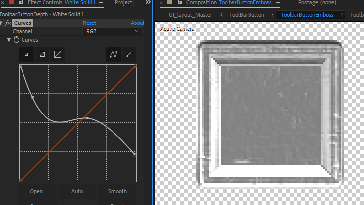
because the flat top on the button looks super boring. I am adding a ramp on top to shape the button like an inwards curve. Like a fader on a mixer table. I) really need to be thingking of this grayscale map as a 3D shape at all times to be ably to shape it how I like. Again. I am using a black to white ramp running trough the whole image and then shaping the gradient with a curves effect.
Now, the button is starting to look nice, but because it is too clean it needs the additional photo layer on top.
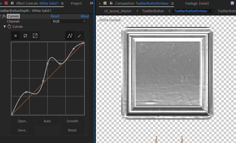
Perfect.
Now, as the button is “3D” we can change the lighting however we wish and use how many lights we want.
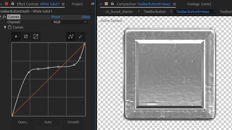
We can also change the bevel into anything we like. Or the shape.
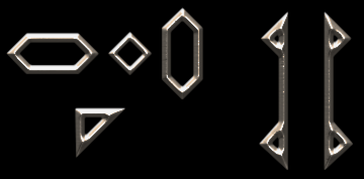
This breakdown was only for the simple button, but all elements in the UI are based on these same principles. I am even creating an assortment of metal details we can use to style the elements.
This may seem complicated, but once you get the hang of it it becomes a really powerful tool for you to create artwork with nearly endless potential for changing anything at any time.
For me, being able to tweak everything is really important, as I usually have no idea what it is I am trying to achieve. Only after seeing the results and being able to fool around with the look of everything I am able to start to form an idea of what it is that I really like. With a non-destructive system like this, this is possible.
And the next time I feel like redoing the whole UI in the game. it will be a lot faster, as every element is linked to a PNG on my hard drive and I can just make all my changes and press render and the Ui in unity updates automatically to match my new whims!
Leave a Reply